Some time back, I developed a roll of color film in a slew of other rolls without paying attention. The edges were unlabeled and for the life of me I couldn’t figure out what stock it was. I had an empty Cinestill Redrum container, so I thought that might have been it. Speculations with friends on my Instagram led to the conclusion that it was most likely Lomography’s Metropolis instead, which, to be frank, has yet to yield decent results for me. That’s a different subject, however, for a different post!

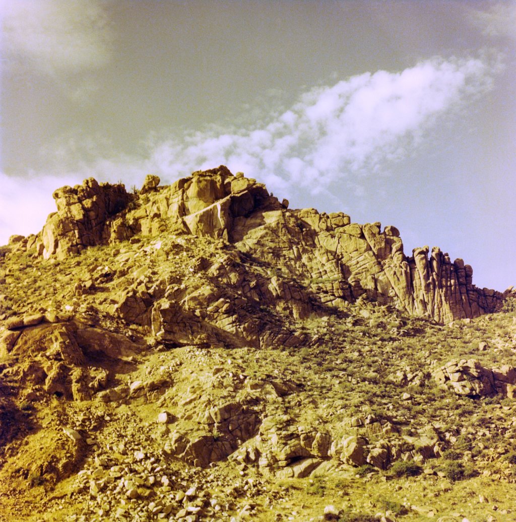
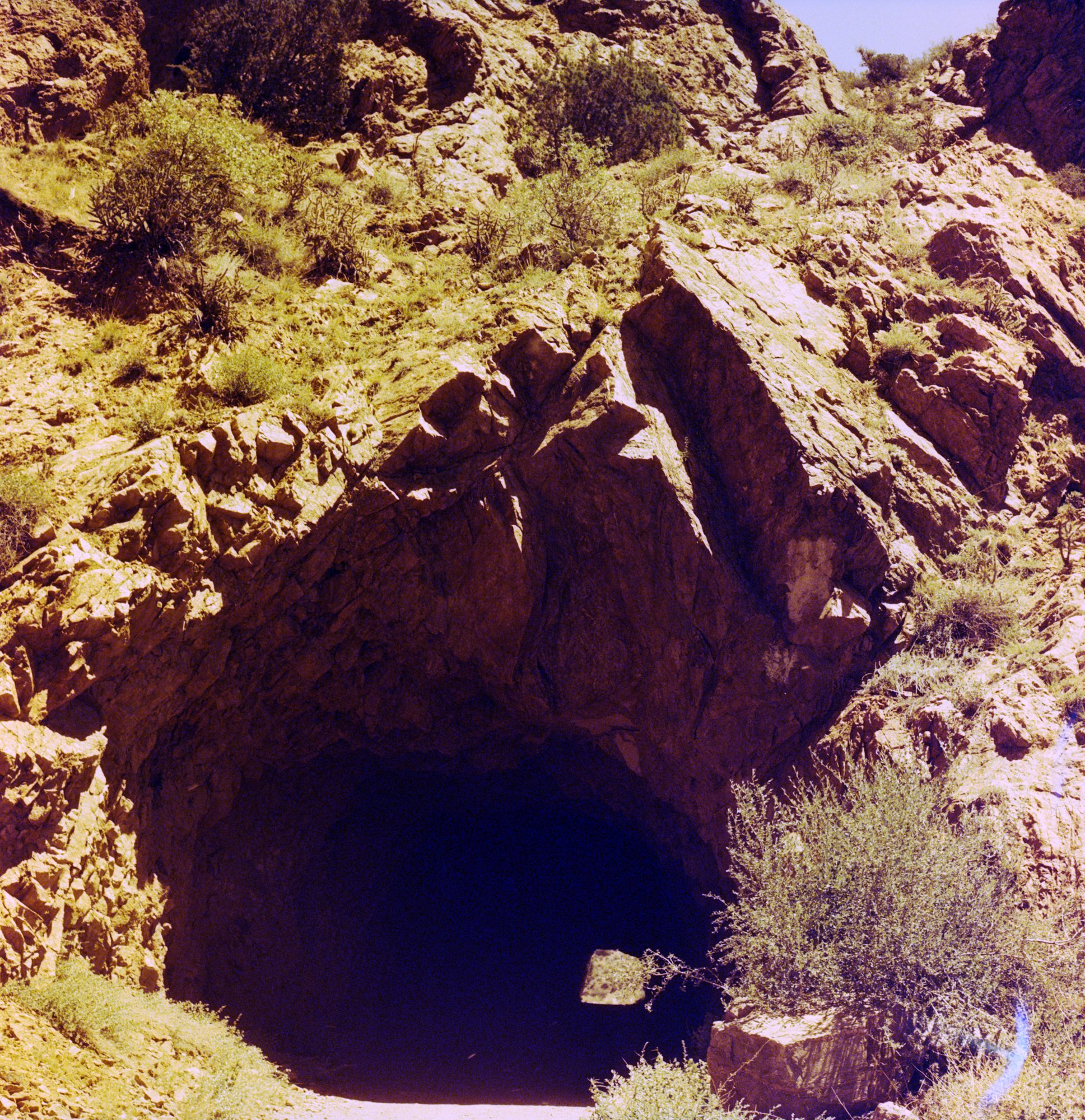
Tunnel Drive Trail, Canon City, CO
Fast forward to my most recent color developing bonanza, and I was much more careful to make a note of each roll, in order, as I loaded them into the tanks. THIS time I was certain I had a roll of exposed Redrum, and I kept track of it. (I even labeled the negatives as they were hung up to dry.)
Color processing is not my favorite, in case you can’t tell.

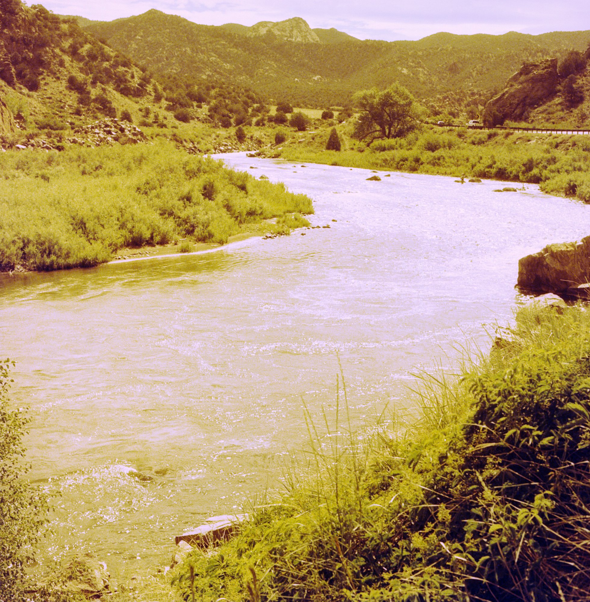
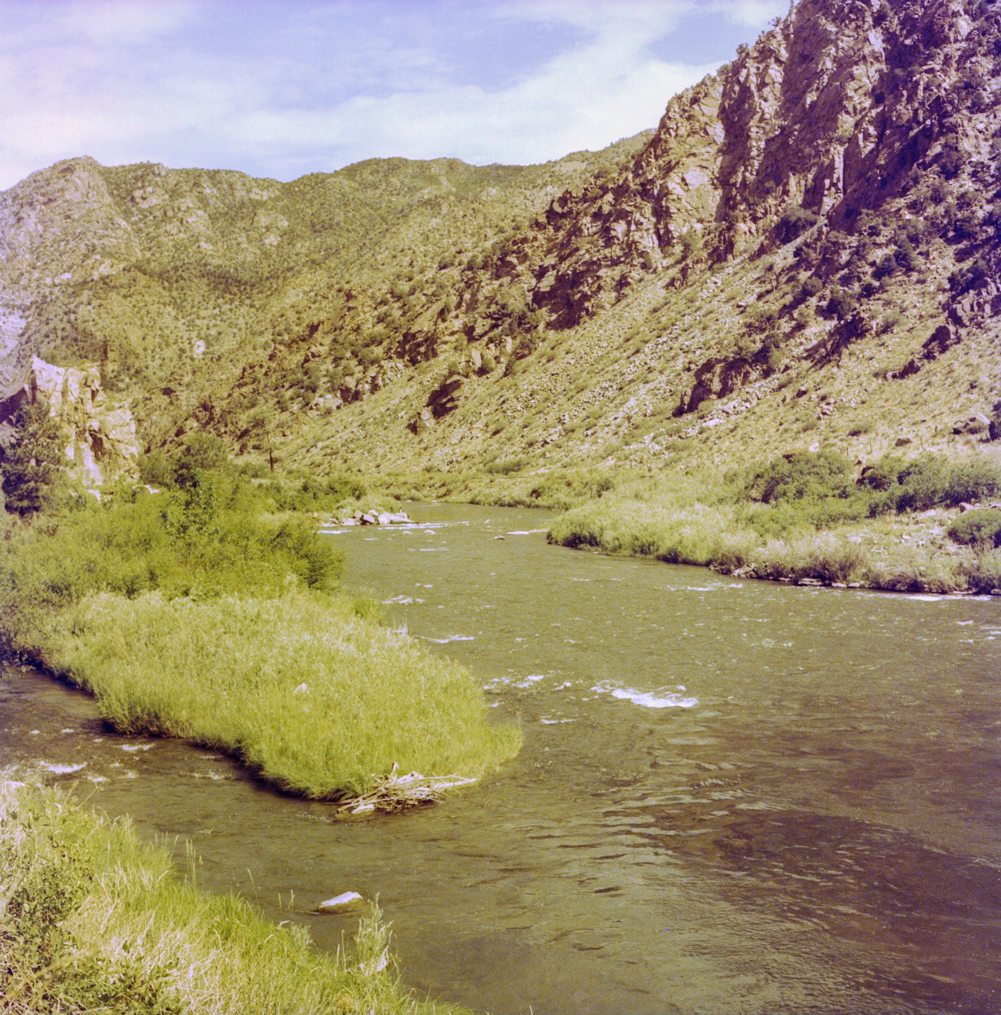
Somewhere in Colorado
I have been sitting on a few rolls of the Redrum film even since it was released; Cinestill sent me an email about it in advance, since I have supported many of their projects in the past, so I was able to snap up some of this stock immediately. Of course I want to try every color film out there at least once!
Considering costs these days, and knowing that it was a limited edition film, I waited for just the right situation to bust out the redscale. Last summer in Colorado was the right moment! We went for a hike near Canon City, and to some other places that are lost in my memory but seemed ideal for this kind of film. The last frame was exposed at a San Antonio mission (I had forgotten by then what film was in the camera, as usual).

My experience with redscale is slim, but in the past I have tried to overexpose it as much as possible so that the result is more sepia than gore. These medium format images, however, look very yellow to me. I’m not sure if that’s down to my (pathetic) processing skills, or if this is just what the film does.

I experimented with color correction in Lightroom and ended up with photos that looked like regular color, instead of redscale.


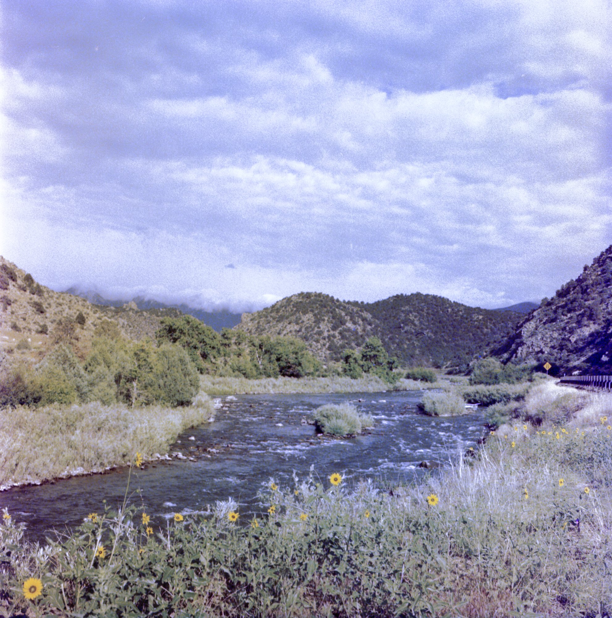
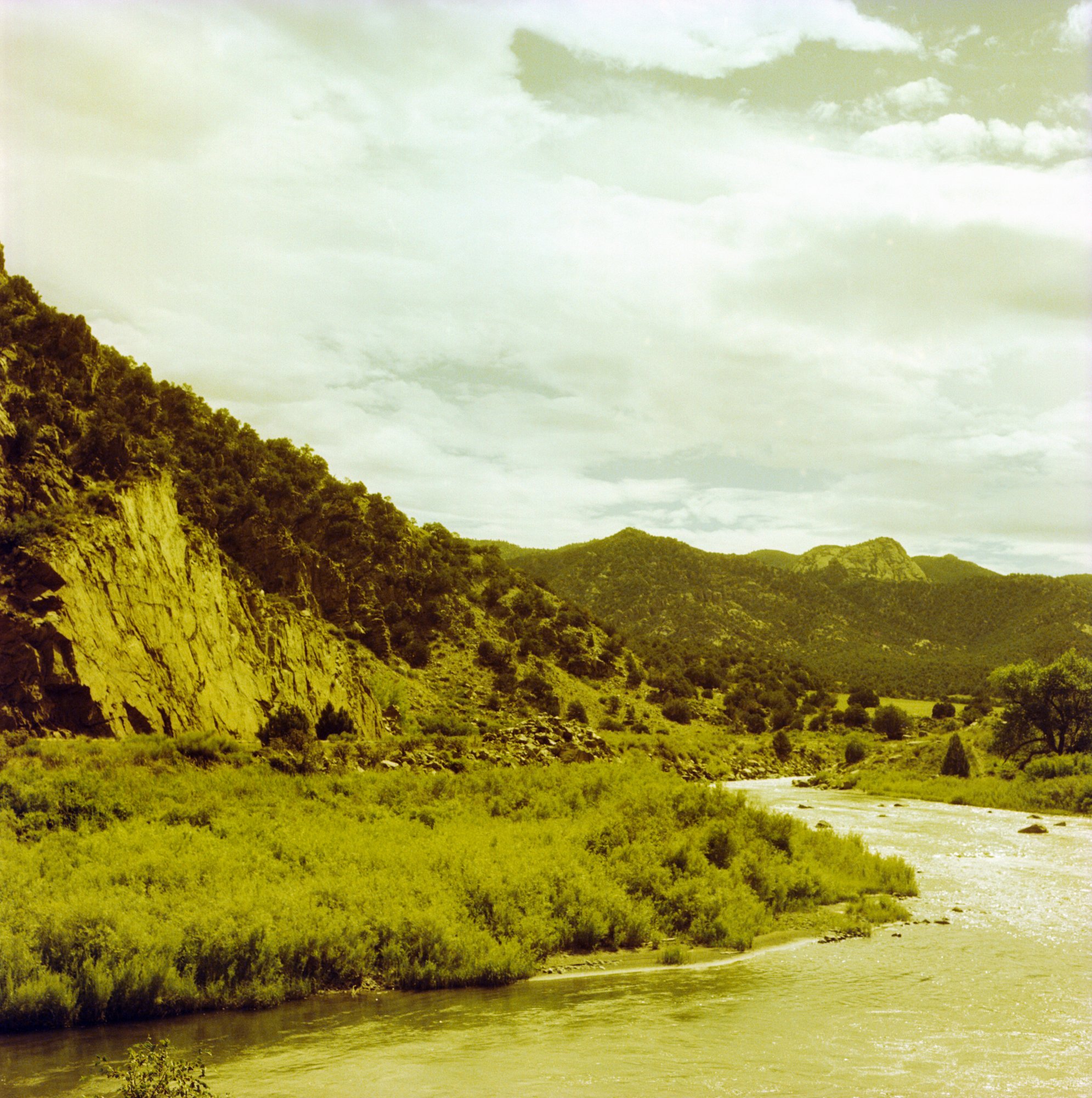
Below are side by side comparisons – as scanned / color “corrected.” They are not the same image, but they are the same location, looking in two different directions. (Bighorn Canyon, if you’re interested, and yep we saw a bunch of bighorns right by the road, engaging in all kinds of bighorn behavior and shenanigans.)
#block-yui_3_17_2_1_1676478671928_79203 .sqs-gallery-block-grid .sqs-gallery-design-grid { margin-right: -10px; }
#block-yui_3_17_2_1_1676478671928_79203 .sqs-gallery-block-grid .sqs-gallery-design-grid-slide .margin-wrapper { margin-right: 10px; margin-bottom: 10px; }
I’m not sure how I feel about the film, since I had hoped for something a bit more brown and a bit less yellow. If any of you readers have suggestions for me, I am all ears! Have you tried the film? How did it react for you?

Next month I will be at Big Bend National Park. Guess who else gets to come: Redrum! With a name like that, and the packaging, I can’t resist it. I might be on the fence about the results, but I sure am looking forward to playing with it again soon. Thanks for reading!
All images in this article are from the same roll, put through my Hasselblad 500 cm

Leave a comment